To make the digipack I used a website called 'Canva' to put all of the images and text together.

After the focus group, I used their comments about the digipack to improve it and make sure it fit better with the genre and the other products. I decided to se a TV on the front cover instead of the skull because it fits better with the genre of our band, and less like 'death metal' or 'heavy rock'. The geometric style of the front cover fits better with the conventions of similar products, and with what the focus group suggested. The TV also fits with the other two products, making the campaign more cohesive.
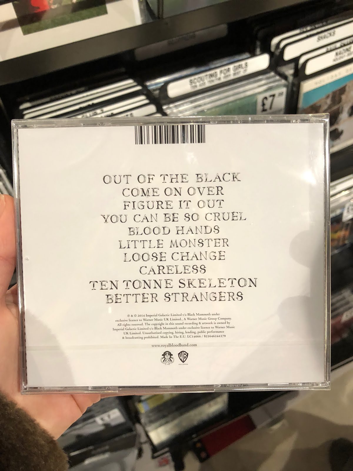
I also took the skull off of the CD panel and put in the same geometric design on the front cover to keep the same theme running throughout the panels. I kept the photo panel and the back the same because they still fit with the other panels and the genre.
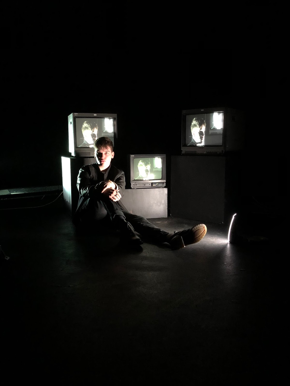
To make the TV I took inspiration from the ones in our music video and from some other ones online, and on Keynote I created my own design to go on the front cover.


After the focus group, I used their comments about the digipack to improve it and make sure it fit better with the genre and the other products. I decided to se a TV on the front cover instead of the skull because it fits better with the genre of our band, and less like 'death metal' or 'heavy rock'. The geometric style of the front cover fits better with the conventions of similar products, and with what the focus group suggested. The TV also fits with the other two products, making the campaign more cohesive.
I also took the skull off of the CD panel and put in the same geometric design on the front cover to keep the same theme running throughout the panels. I kept the photo panel and the back the same because they still fit with the other panels and the genre.
To make the TV I took inspiration from the ones in our music video and from some other ones online, and on Keynote I created my own design to go on the front cover.